Future-Proof Design Principles
The Internet is a resource, specifically designed by people to help people. It is here to make our lives easier and more enjoyable.
Why do we sometimes feel like it is a fool’s paradise? Is it a net to tie us down or pull us up? Most importantly, how do we make it better?
I must admit I’ve had my doubts from time to time. It first seemed to me that the Internet was a playground for people with a lot of money to capture my attention while I went about my daily business. This paranoia was fostered by the unrelenting pop-ups of the 90’s, a condition soon improved and with it my sense of Internet wellbeing. Now, we have access to more services than ever before, most of which are funded at no greater cost than the grains of attention that I readily disperse over the sterile soil of side-bars and brightly colored banners.
Think about it. We can navigate to nearly any location we’d like, virtually tour any locale in the world, communicate at near light-speed, or shop in the largest marketplace ever from the comfort of an armchair. This progression has been inexorable despite economic depression and more rapid than even Moore could have anticipated. So I invite you to analyze these trends with me, prima facie, to see where we’re headed and what it means for the future of website design. In turn, feel free to gauge your own business’s future-readiness as we talk about what holds true even when the side-bars disappear.
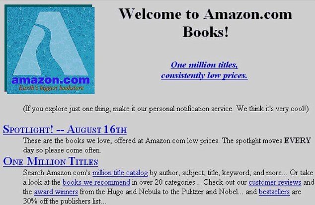
To the left you can glance the first server ever hosting information for the first enterprising internet users at CERN. Like many projects of our recent past, the Internet evolved from a field with a dense concentration of money and technical skill. The same technology that accommodated the need for physicists to share their large datasets has evolved to handle the much larger dataset of food photography. What was once simply for the well-connected has spread to become a commonplace tool that has grown in power as it expanded to include more people. Let’s call this movement toward the masses the egalitarian trend.
The internet used to be a jumble of navigation, our browsers struggling for compatibility even with dropdown menus. Now, both the young and old are expected to interface with computers and the navigation schemes are still playing catch-up. Oftentimes the most challenging factor in design is in predicting the user’s next move, to offer them the perfect opportunity.
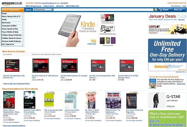
The design of websites has changed dramatically since the beginning of the web, so far moving in the direction of simple navigation, ample suggestions made from browsing history, and permitting intuitive interaction to allow sales to be as natural as they are in the marketplace. In short, design is beginning to emulate the model of the effective salesman or a wise librarian: delivering just the right information, at just the right time, to permit the client to expend minimal effort without intruding on their search process. Let us call this quest for simplicity the elegance trend.
Finally, the web is becoming more fun. That’s right: you’re even having fun right now, even as you are performing marketing research. The lightheartedness of the web is ubiquitous and still catching. Positivity is infinitely more attractive in personal conversation, and it turns out that in marketing, especially immersive marketing, it is even more important.
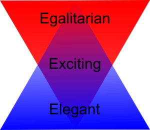
Yet, fun is more complex than that. It is truly a fusion of both of our prior trends of elegance and egalitarianism mixed with a little touch of positive playfulness. It may be best epitomized as a big game where everyone is enthusiastically contributing their own unique role, encouraging others at the same time as projecting their own unique perspective.
This latter trend might be summarized as the excitement trend. This thrilling quality that makes users eager to contribute is the secret of truly successful Internet projects. We need not look far to see the power of crowdsourcing. The key here is to permit every user to contribute, to make it simple to participate, and to make it a pleasant environment where everyone feels welcome. Ultimately, your result is a high-value user experience that yields lasting brand loyalty and enthusiasm.
 Three E’s for Future-Proof Web Design
As always, I’ve kept it short and sweet. I hope you enjoyed reading as much as I enjoy your readership! All of these topics will be expounded in future posts, though I am particularly looking into the far-future and growing excited about gamification. Look forward with me and read again soon!


